Pinterest just released its color palette for 2025, and I couldn’t resist imagining how to use these trending colors in website design. So I thought, why not take you along for the ride! In this blog post, I’ll share the palette along with their color codes so that you can easily incorporate them into your own designs to make your website stand out and keep up with the trends.
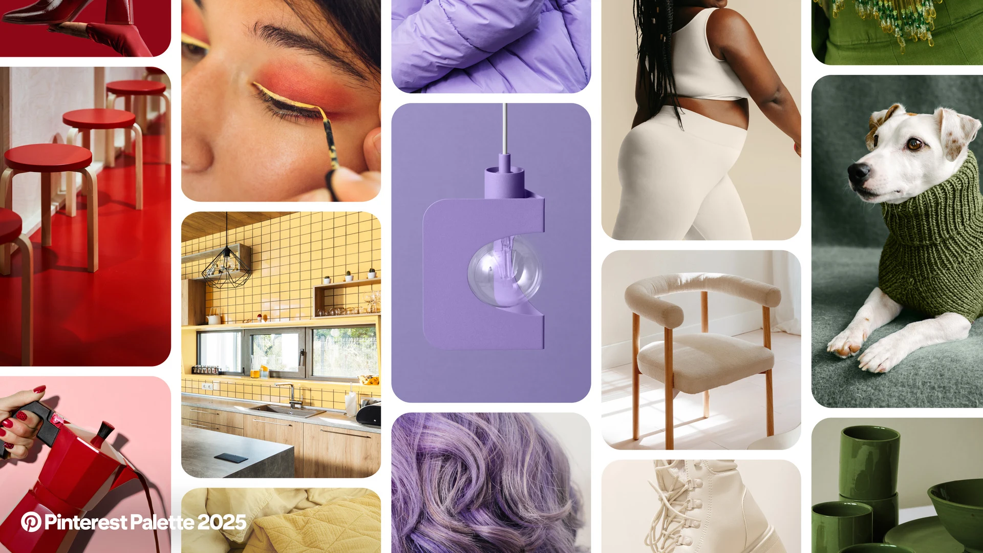
Pinterest’s 2025 Color Palette
First impressions? I’m loving four out of the five colors! They’re rich, on-trend, and perfect for bringing fresh energy to website designs in 2025. Let’s dive in and explore each one.
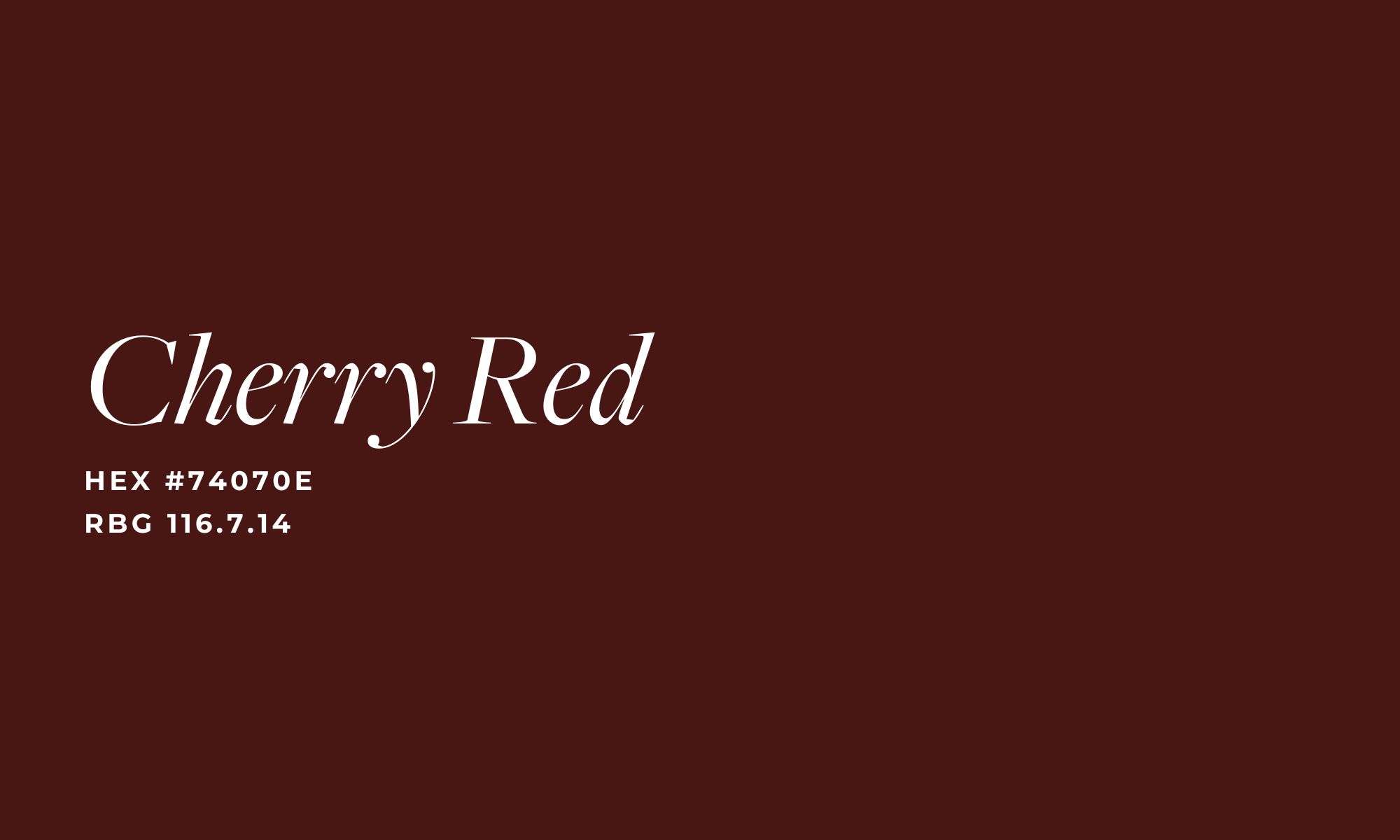
Cherry Red
Deep red speaks to my soul. It’s bold, attention-grabbing, and leaves a lasting impression. In website design, I’d use it as an accent color to guide the eye and make key elements pop—think buttons, headings, or even a notification bar just above the top navigation. Here’s an example of how it could work beautifully in a website design:
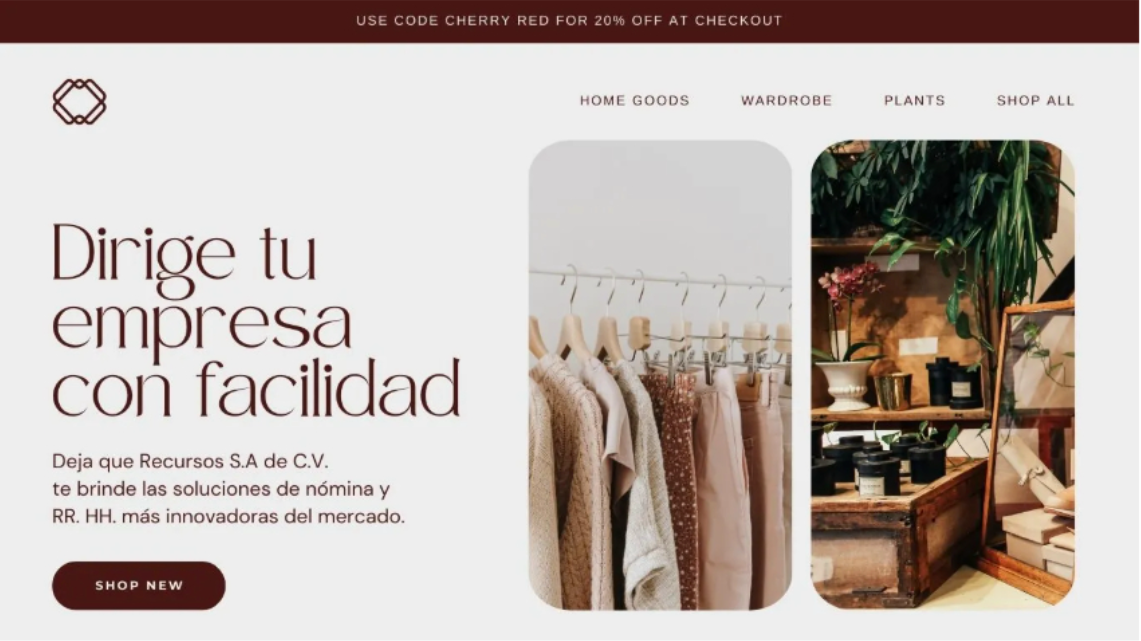
It’s a color that strikes a unique balance: bold enough to make a statement yet subtle enough to remain sophisticated. What do you think of Cherry Red?
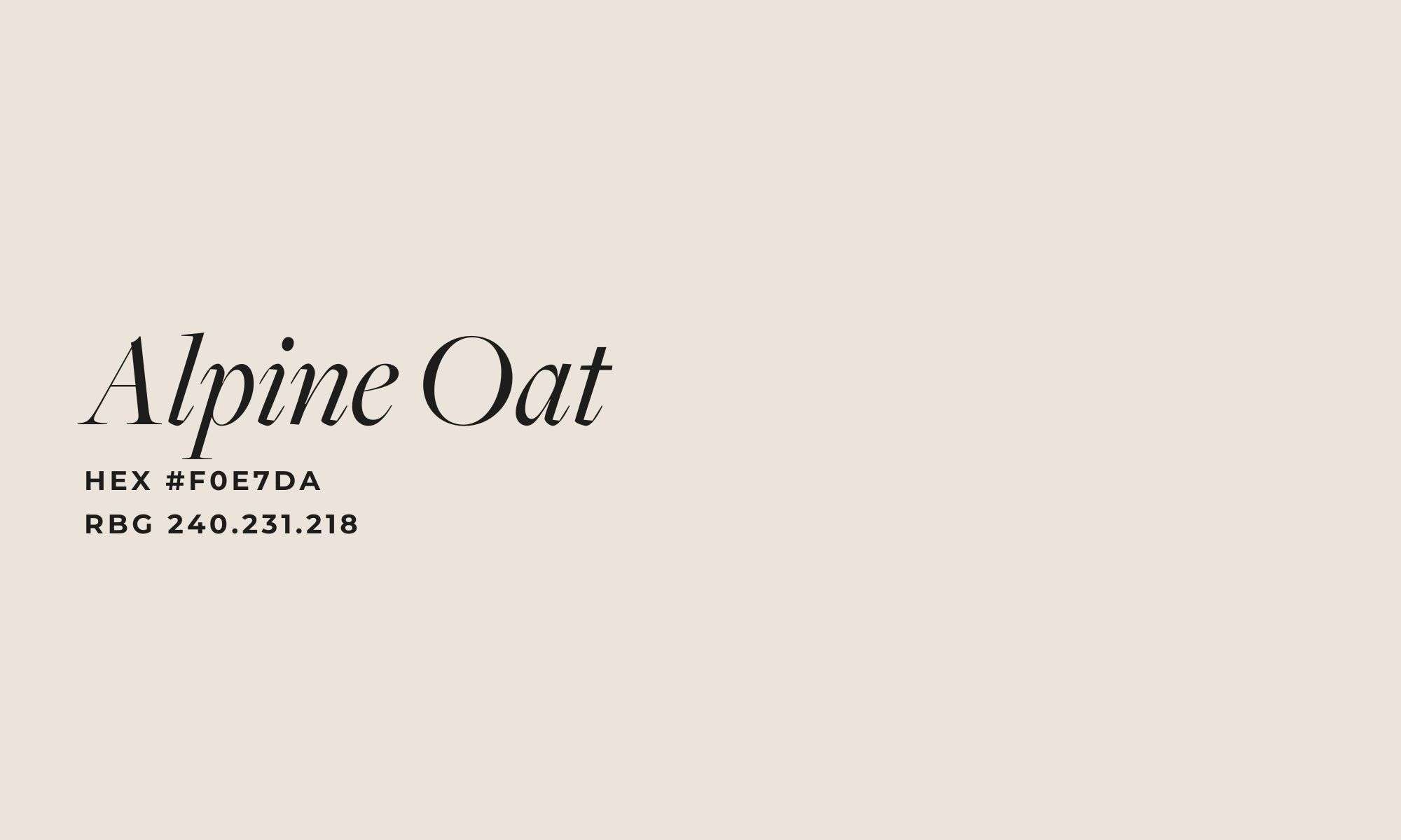
Alpine Oat
I’m a total sucker for neutrals, so it’s no surprise that Alpine Oat is one of my favorites from the palette! This shade is an amazing base color for web design, exuding warm, holistic, and wellness-inspired vibes. Here’s how I’d incorporate it into a website design to create a calming, inviting aesthetic.
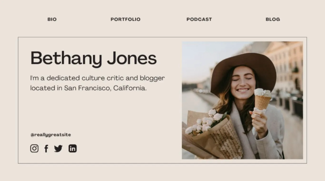
I’d use Alpine Oat as the global background color for a website. Its soft yet polished look creates a calm and inviting feeling, making it an ideal choice for wellness or health-focused sites. This versatile neutral sets the stage for other colors to shine while maintaining an elegant and cohesive design.
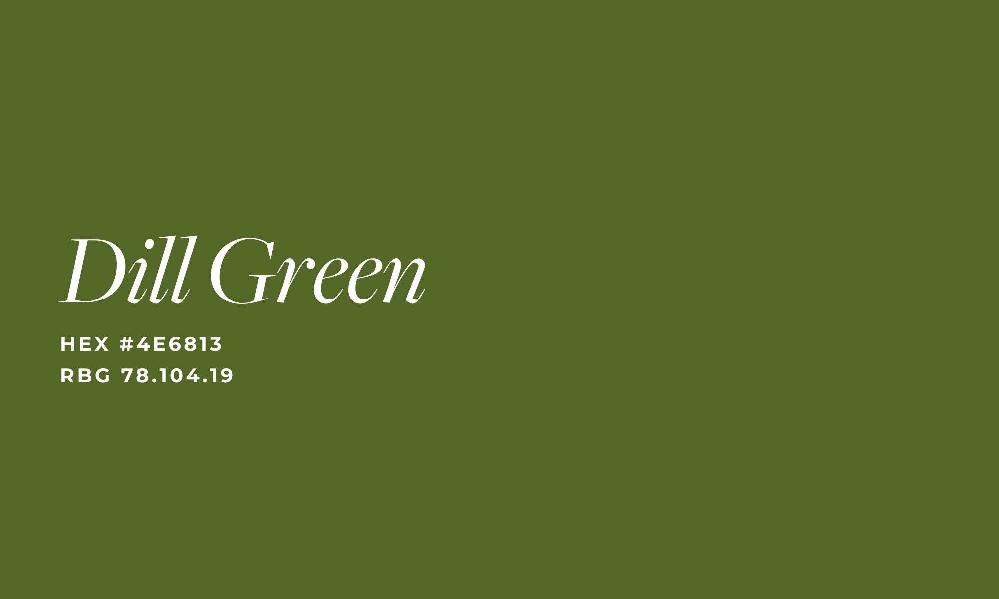
Dill Green
I’ve always been drawn to earthy tones, and nothing embodies that vibe more than green! This shade instantly reminds me of a website I designed two years ago for Colorado Senior Dog Rescue & Hospice. It brought a sense of warmth, nature, and trust to their online presence—perfect for their mission.
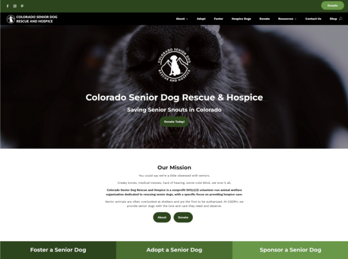
We chose green as their primary color because it perfectly reflected their location in the Colorado mountains and the hopeful, nurturing spirit of their work with senior dogs. It was the ideal choice to convey both their connection to nature and their mission of care and compassion.
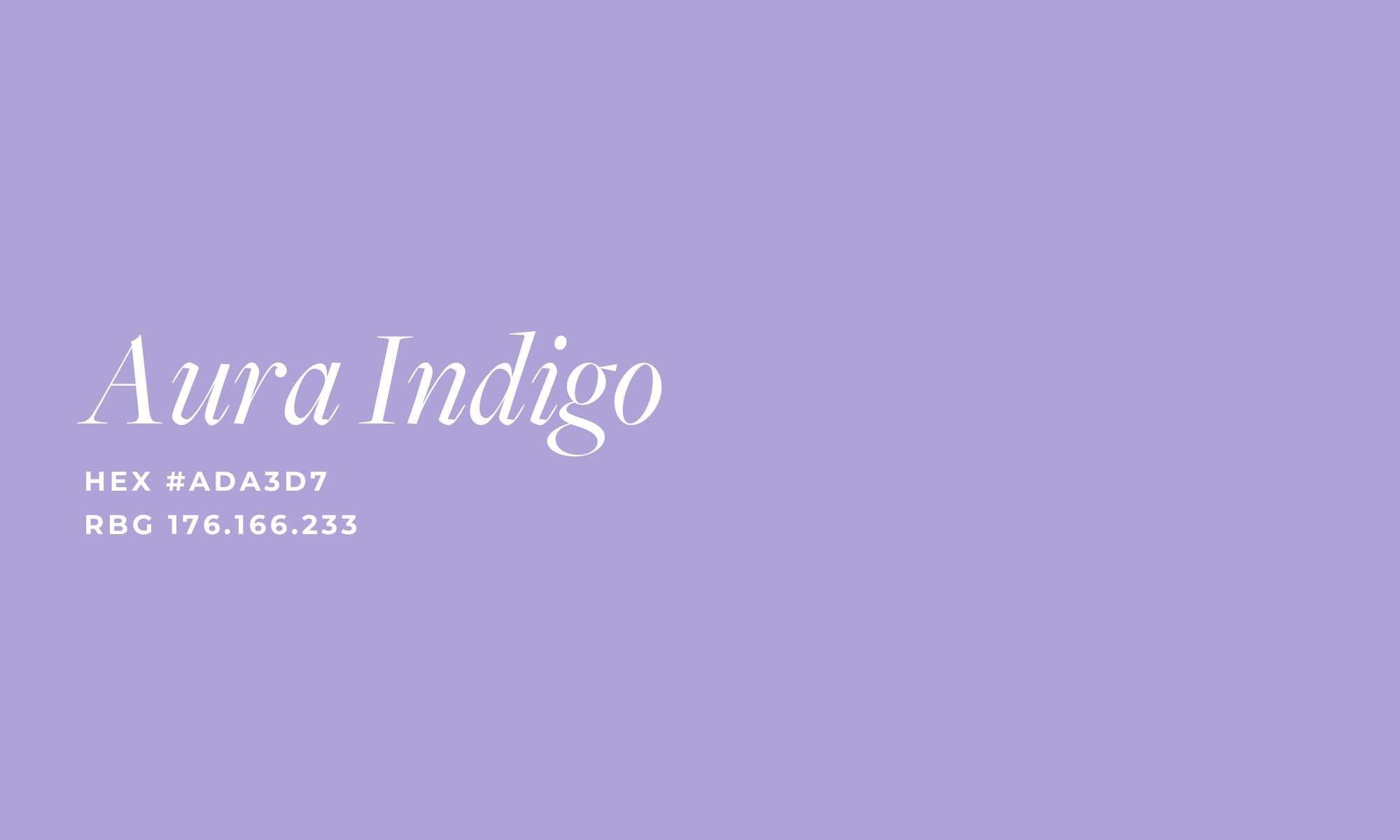
Aura Indigo
Next up is Aura Indigo. This soft pastel purple hits the perfect balance – it’s not too soft or too rich. It instantly takes me back to the 90s, reminding me of the purple shades often seen in iconic designs like Polly Pockets! It’s nostalgic yet modern, offering a playful yet elegant touch to any design.
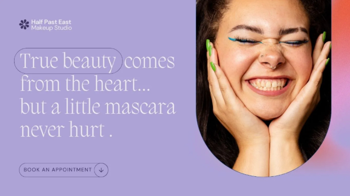
This color would be perfect for a beauty website, as it embodies the idea of embracing all the colors of the rainbow and inspiring creativity. Aura Indigo’s unique hue adds a playful yet sophisticated touch, making it ideal for a brand that celebrates individuality and self-expression.
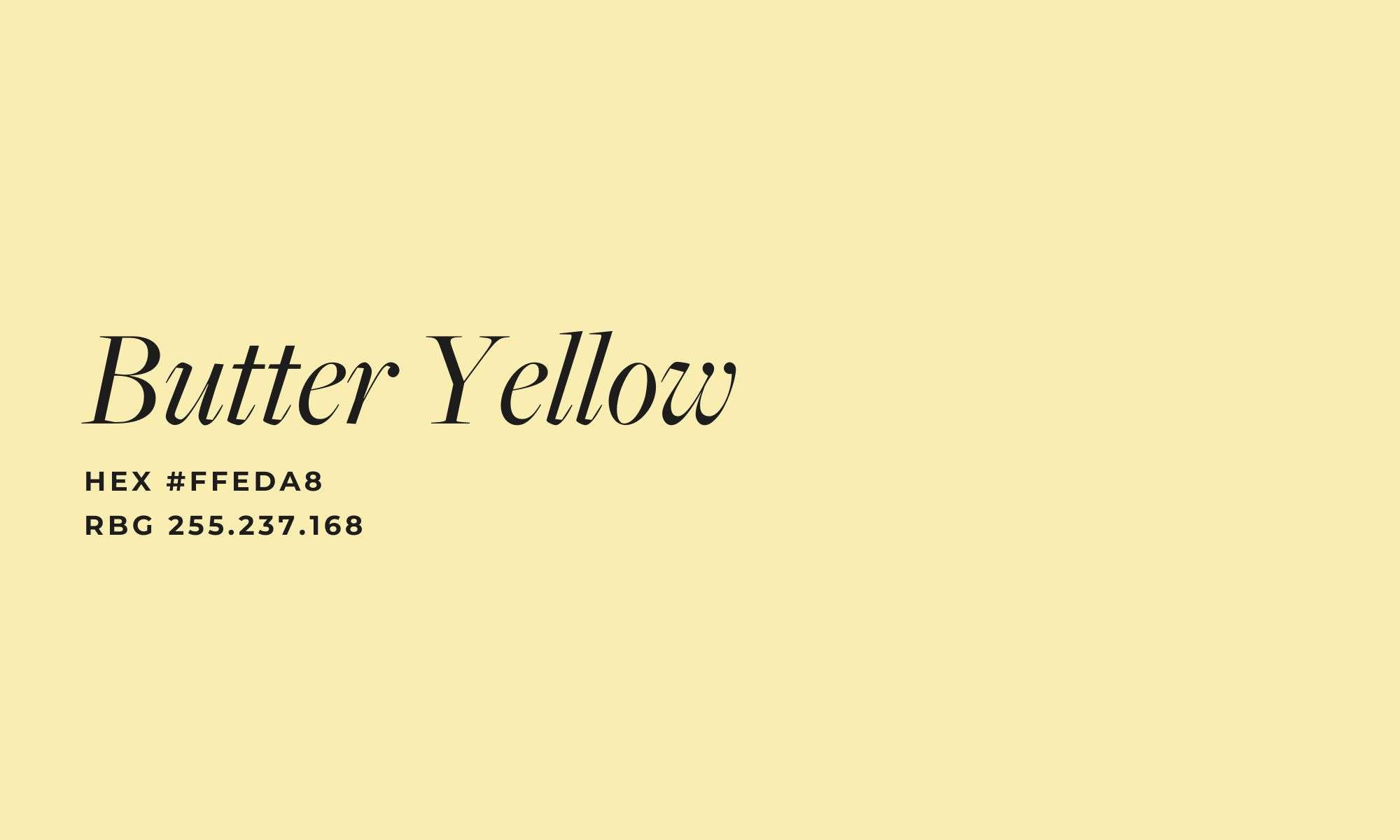
Butter Yellow
And last my but least is Butter Yellow. I gotta be honest with you, this is not my favorite color. I’m more drawn to mustard shades of yellow, not pastel ones. However, I’m always up for a challenge! Here is how I would incorporate it into a web design:
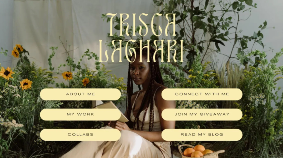
In this mockup, I used an image background of a plant store to anchor the design with earthy tones. The soft, pastel yellow is applied to the font and buttons, but the natural hues in the background help to balance it out. This creates a subtle, warm contrast that adds a touch of brightness to the design without overpowering the senses. It’s a perfect example of how to use a bold color like yellow in a more restrained way, allowing it to gently stand out in a sophisticated and eye-friendly way.
Final Thoughts
Exploring the 2025 Pinterest color palette with you has been a fun exercise in creativity, and I hope it’s sparked some fresh ideas for your own website design!
Whether you’re looking to incorporate bold hues or subtle tones, the right color palette can truly elevate your online presence.
If you’re ready to bring these colors – or any other design visions you have – to life, I’d love to help. As a strategic web designer, I specialize in creating custom, high-converting websites that reflect your unique brand and goals.
Let’s collaborate to craft a stunning site that not only looks great but also drives results. Reach out today, and let’s get started on your next project!



0 Comments